

Milford Photo Expo 2026 - Visit
MAC Downtown Gallery
May 7 – June 5
Tuesdays – Fridays, 12-4 P
Artwork Pickup: Friday, June 5, 4-6pm // Saturday, June 6, 10 – Noon.
Our yearly collaboration with Milford Photo placing photographic and digital art front and center.
There was no set theme defined for this show.
Exhibit Judge
Anastasia Fasnakis
Milford Photo
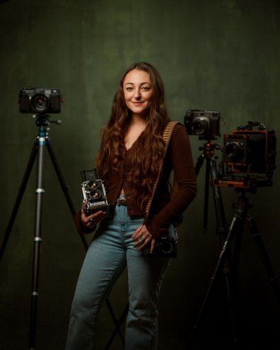
Anastasia is a Greek-American photographer based in Connecticut who earned her BFA in Photography from Paier College of Art in 2016. She has a strong technical background in both analog and digital processes, with hands-on experience in film development, darkroom printing, and studio lighting.
#
Her travel-driven work has been published in Condé Nast Traveler, Monovision Photography Awards, Shoot It With Film, and Analogue Forever Mag, reflecting her ongoing interest in culture and landscape.
#
She spent six years working in a photo studio as a portrait photographer before joining Milford Photo, where she has worked for the past four years as a Sales Expert and Marketing Director.
Awarded Works
Milford Photo Expo
Award and Judges Notes
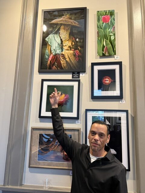
Best In Show: #9 – Ghen
Notes: The color work here is lovely — bold, vibrant tones that feel intentional rather than overwhelming. There’s a beautiful harmony between the hues, and the rich contrast adds depth and dimension instead of distracting from the subject. This is a great example of high contrast being used to strengthen an image emotionally and visually.
Even without seeing her face, the portrait still conveys identity, culture, and presence through the clothing, posture, and atmosphere. The traditional garment gives the image a quiet narrative quality — we feel there’s a story behind the subject without everything being explicitly revealed. That sense of mystery makes the portrait even more engaging and memorable.
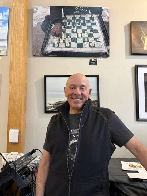
1st Place Color: #79 – Chess Master
Notes: Love the atmosphere in this shot. Even with the tight crop, there’s just enough detail to establish the environment — the snow on the ground, the damp surface of the chess table, and the cold weather all come through clearly. The framing does a great job of emphasizing the makeshift nature of the chess setup, and the taped details add so much character and authenticity to the scene.
The single hand in the composition anchors the viewer’s eye immediately and gives the image its narrative focus. It feels intimate and observational at the same time. The aerial perspective is especially compelling — it creates the sensation of standing over the player, quietly watching the game unfold. Strong composition overall, with a perspective that makes the moment feel immersive and real.
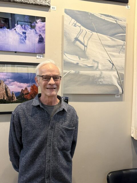
2nd Place Color: #49 – Mystic
Notes: A lovely abstract indeed. At first glance, it truly does resemble a painting — the soft transitions between shape, texture, and shadow create an almost brushstroke-like quality. The cool-toned palette gives the impression of ice or snow, while the subtle textures slowly reveal the presence of fabric, creating an interesting visual tension between softness and structure.
The interplay of light and shadow adds beautiful depth throughout the composition, especially in the way the rope shadows fall across the folds. Everything feels very intentional: the framing guides the viewer naturally through the lines and curves, encouraging the eye to wander and explore the image slowly. The ambiguity of the medium is one of the strongest aspects here — the fact that it could convincingly be mistaken for a painting makes the photograph even more compelling as a piece of art.
1st Place BW: #44 A Look of Wonder
Notes: Gorgeous tonality throughout this portrait. Her expression is incredibly captivating and holds the viewer’s attention immediately. There’s a quiet strength and confidence in the way she’s presented that makes the portrait feel deeply human and memorable.
The framing is especially well considered. I love the way her hat visually aligns with the mountains in the background; it creates a beautiful sense of connection between the subject and the landscape around her. The composition feels balanced and intentional, as though the photographer was patiently waiting for this exact moment to come together. Altogether, the image feels observant, respectful, and thoughtfully captured.
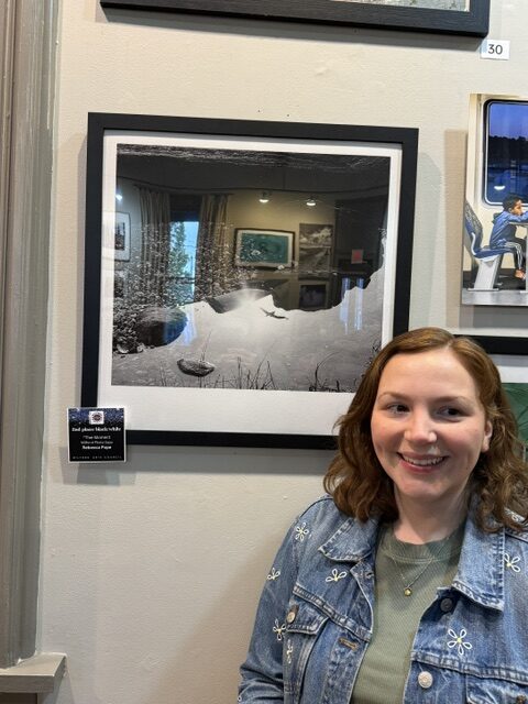
2nd Place BW: #73: The Moment
Notes: The deep contrast in this black-and-white image is used beautifully — bold and dramatic, yet clearly very intentional. Rather than overpowering the scene, the contrast enhances the composition and invites the viewer to explore the interplay between light and shadow more carefully. The balance of dark areas and highlights creates a striking sense of depth and atmosphere.
The reflection of the bird within the water — especially positioned inside what appears to be the sun’s reflection — adds a really compelling visual layer to the image. It creates a subtle focal point that feels both delicate and symbolic. I also love the textures throughout; they give the photograph a tactile quality. Altogether, the image feels classic, immersive, and thoughtfully composed.
Honorable Mentions:
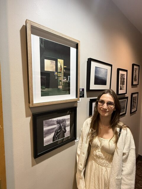
1: #53 – Threshold of Reflection
Notes: Lovely tonality throughout this image — the contrast between the warm light behind the door and the cooler tones surrounding it creates a really cinematic atmosphere. The framing is strong as well, with the doorway naturally becoming the focal point while the darkness around it helps contain the composition.
There’s great attention to detail here too, especially with the subtle pops of yellow that create a nice visual rhythm across the frame. I also love the umbrella detail, which adds a quiet human presence and makes the scene feel lived-in and authentic. What makes the image especially compelling is how an ordinary moment is transformed into something atmospheric and memorable through light and composition.
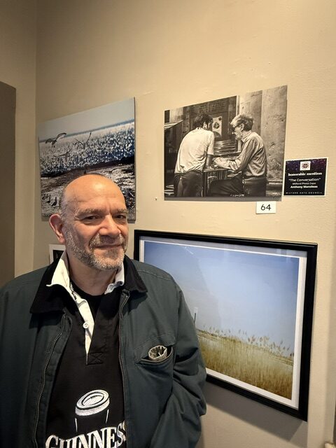
2: #64 – The Conversation
Notes: This image has such a cinematic and timeless feel to it — almost like a still pulled from an old film. It feels completely unposed, as if the viewer simply walked in on a quiet moment between the two men. The black-and-white tonality works beautifully here, adding depth and emphasizing the textures and expressions without distraction.
I also really love the cropping, which keeps the focus tightly on the interaction and makes the scene feel intimate and observational. What makes it especially compelling is how universal it feels — this moment could have happened anywhere, at any time.
3: #76 – The Morning Parlor
Notes: Gorgeous warm tones throughout this image — the entire palette feels rich, inviting, and beautifully cohesive. The composition is very thoughtful and well balanced, with each object placed in a way that naturally guides the viewer’s eye through the frame. The lighting is especially lovely, highlighting just the right areas to create depth and emphasize the textures of the glass, wood, and paper.
There’s a real sense of tangibility here; the image feels tactile, almost as if you could reach out and touch every surface. Altogether, it has a polished yet comforting atmosphere that makes the still life feel both artistic and lived-in.
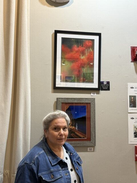
4: #93 – Behind the Rain
Notes: This image has a really strong atmospheric feel to it. The condensation over the glass adds depth and texture while still allowing the subject to come through clearly. I like the framing and the way the reds contrast with the cooler green tones. The water droplets and streaks make the image feel soft and slightly painterly. Even though the subject is partially obscured, it still holds a clear focal point and keeps the viewer engaged.
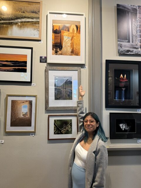
Reception Photos
For complete information about the exhibit, see the Artist Call Prospectus using the link below.
Many thanks to our sponsor,
Milford Photo
